
NAT GEO
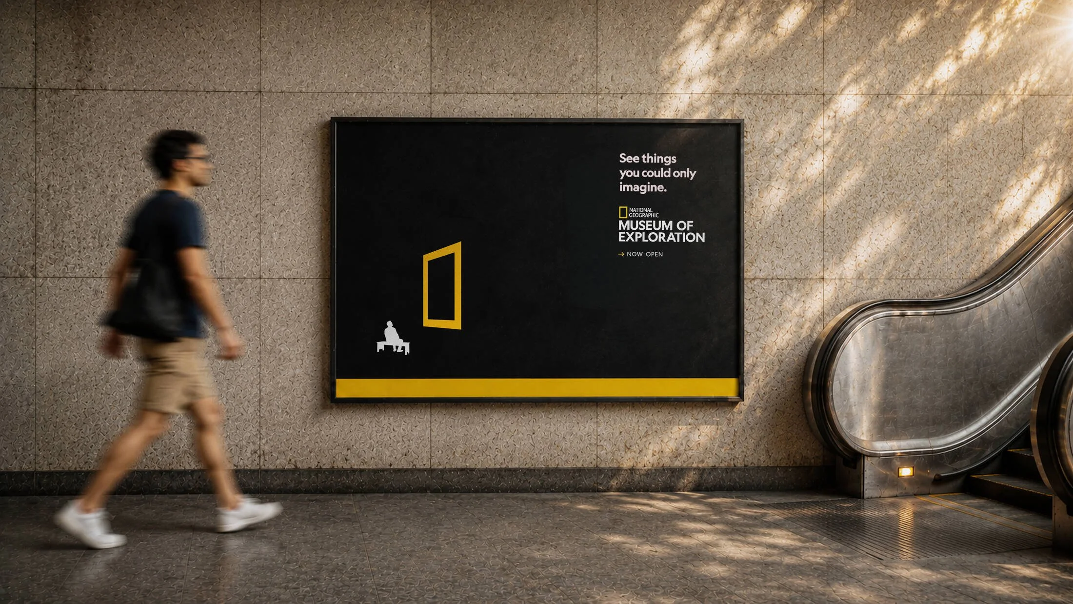
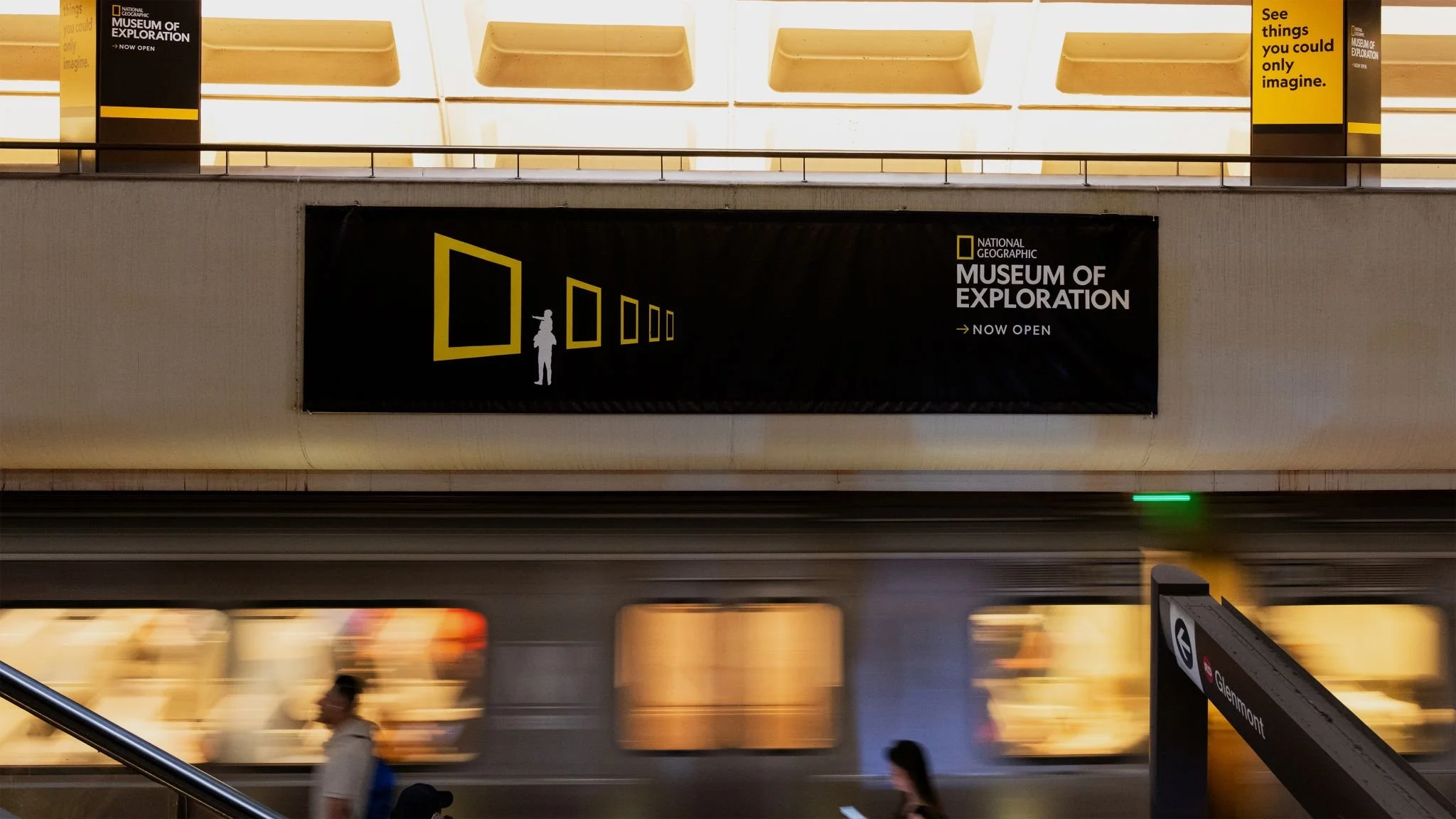
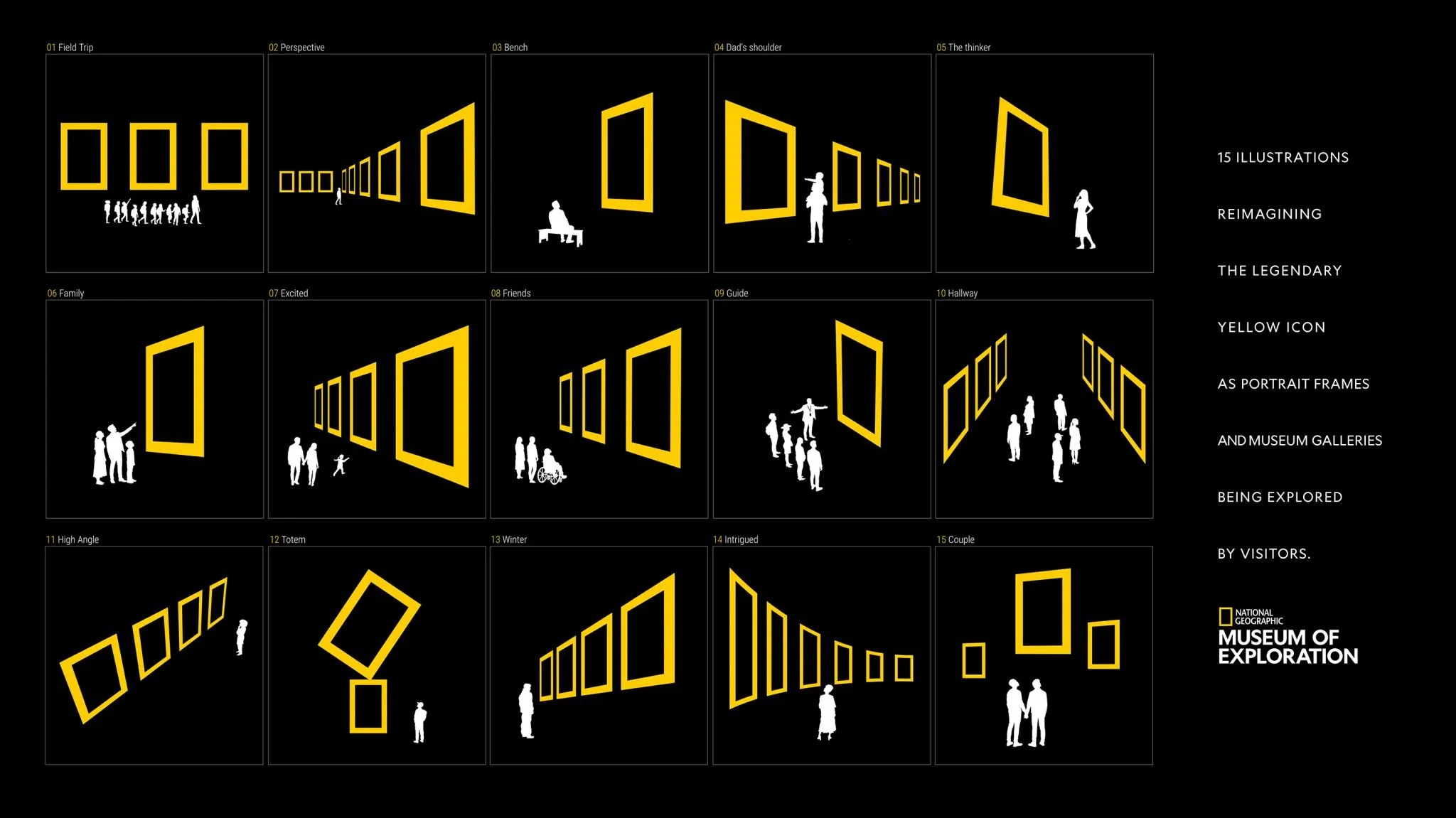
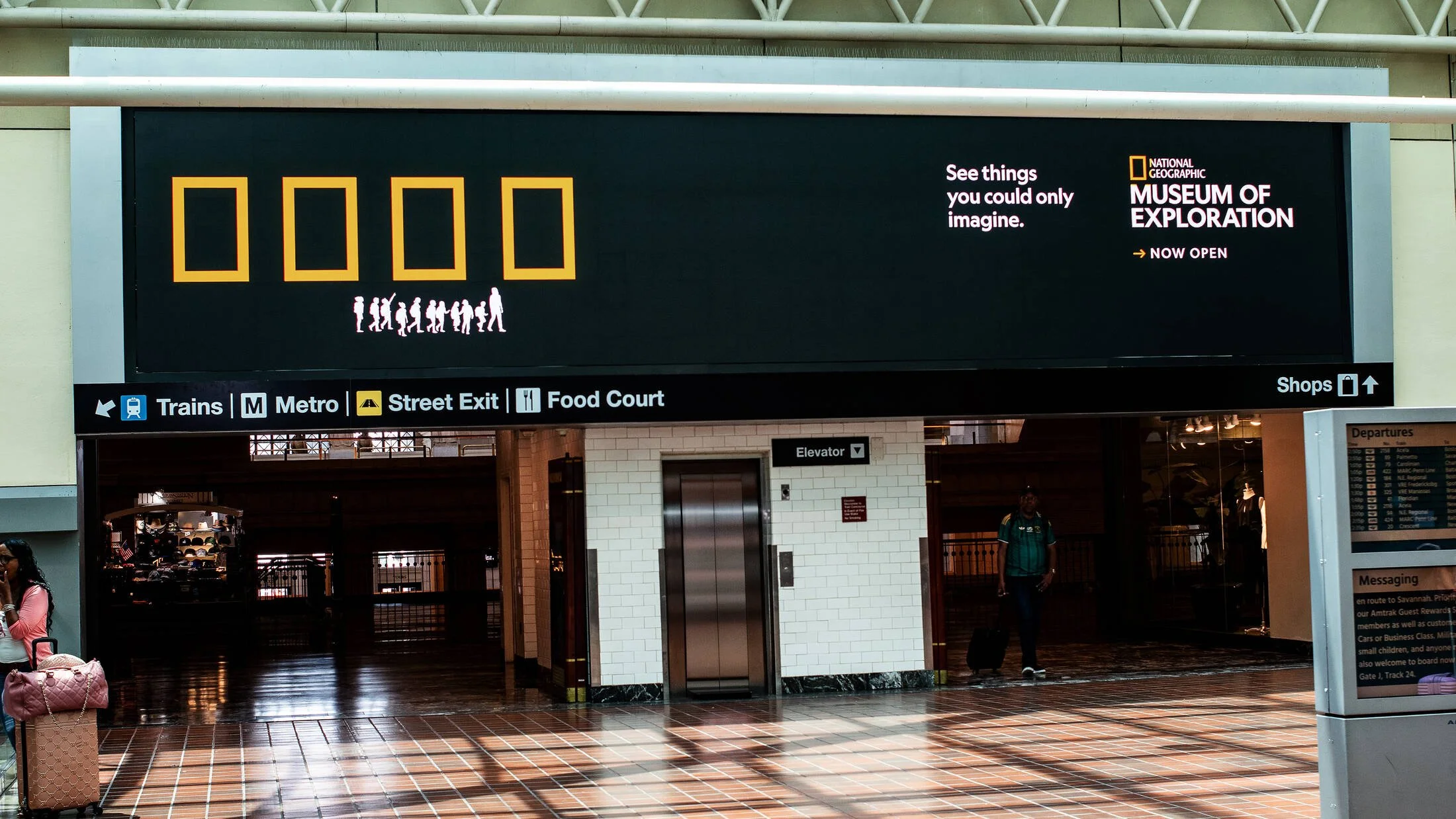
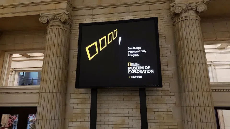
The yellow rectangle is one of those design elements you see and immediately think: Nat Geo. So for the launch of the Museum of Exploration, we pushed it beyond the logo, reimagining it as a visual language for the museum itself.
FEATURED: AD AGE | MUSE | LITTLE BLACK BOOK
created at Terri & Sandy | copywriter: grace barratt | art direction: yuliya kosheeva & tracy okafor | creative directors: phil fattore & rafa oliveira